In The Timeless Way of Building (1979), Christopher Alexander argues for the counterintuitive proposition that feeling (in the sense of perceiving the beauty and “life” of a space), unlike ideas or opinions, is quite objective; there is an astounding level of agreement between people about how different environments and buildings feel, though there may be little agreement of opinions or ideas about them in general. I reproduce here a few crucial paragraphs from Chapter 15 of the book, which chapter and book I of course recommend reading in their entirety.
Another 500 page book I recommend reading in its entirety is Alexander’s The Nature of Order Volume One: The Phenomenon of Life, which, to add insult to reading assignment, is the first in a series of four similarly-sized books. But so that we might share an essential concept from this unlikely-to-be-completed reading assignment, I will make an attempt to explain Alexander’s concept of centers. Instead of architectural examples, I will demonstrate the concept with wedding rings and quilts.
Alexander does not exactly define the “center,” but offers a hermeneutic approach, alternating theory (and occasional very light math) with demonstrative examples. Cherry picking some of the more enlightening theory, centers are zones, sets of points in space, that have wholeness or coherence. They are things that have a particular “fit” with human perception and cognition, such that they are easy to perceive, remember, and describe as wholes. An apple is a center, its stem is a center, a spot on the apple’s surface is a center, perhaps its core is a center, but a random square centimeter of flesh within the apple is not a center. Good centers also work together: centers of solid matter create coherent space between them, and centers together form a coherent whole. A few rules or features of centers (the following list is a quotation from p. 83):
- The sets which appear as entities are often locally symmetrical – but not always.
- The entities are usually bounded: that is, at their edge, there is often a sharp change of structure.
- Some of the entities are marked by an internal center where there is another change of continuity near the middle of the center itself.
- There is a simplicity and regularity about these sets which marks them as wholes, and makes them function as entities.
- They are often relatively homogenous across their interior, compared with the surrounding spaces.
- There is a topological connectivity in them which marks them as compact.
- They are usually – not always – convex.
Now that we have some concept of centers, I will present a beautiful and a non-beautiful example of quilts. Again, as Alexander recommends, pay attention to your feelings about each quilt, rather than ideas or opinions you might form.
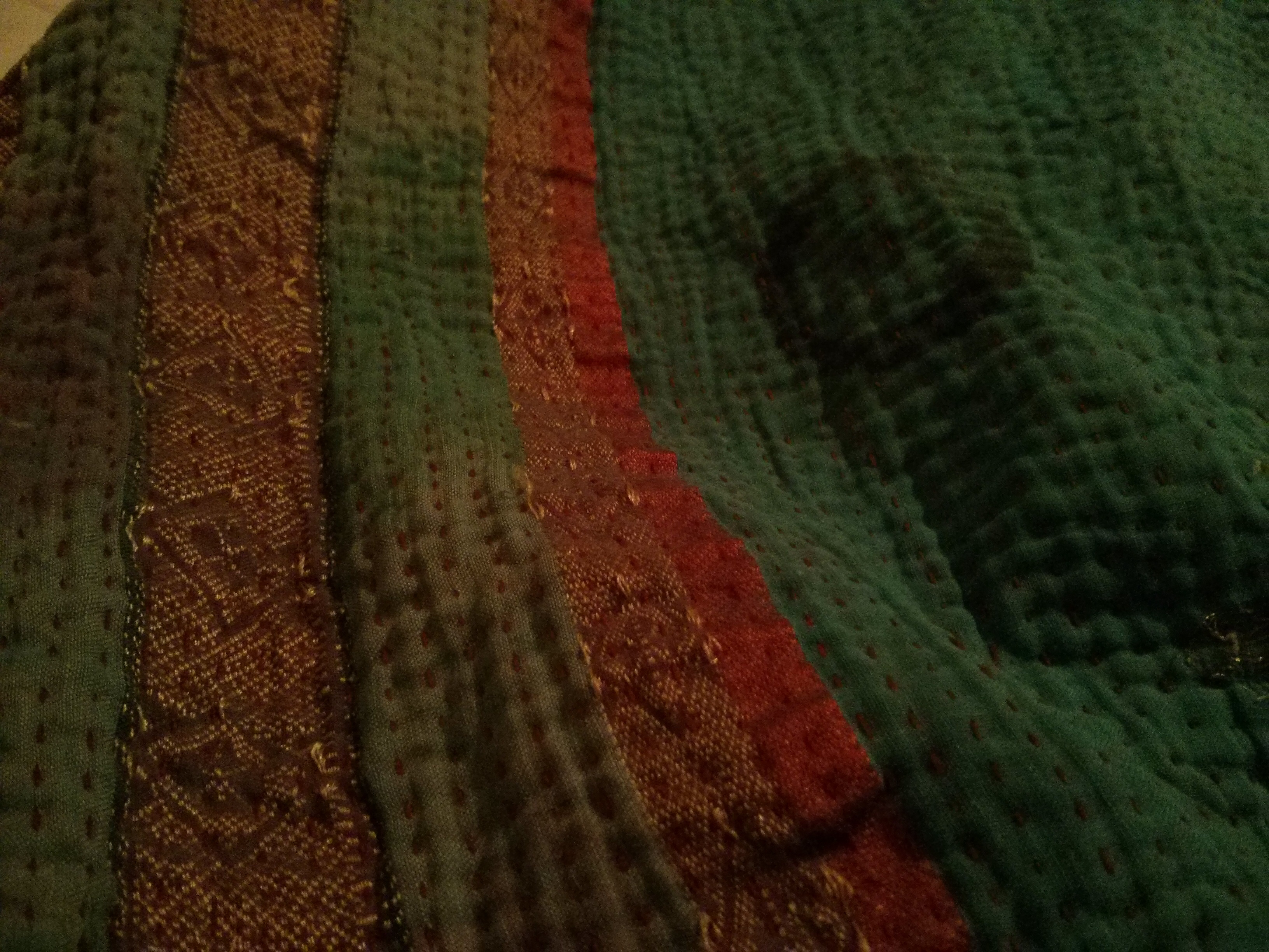
The first is my hand-stitched kantha quilt, made of old saris. Here the top side:


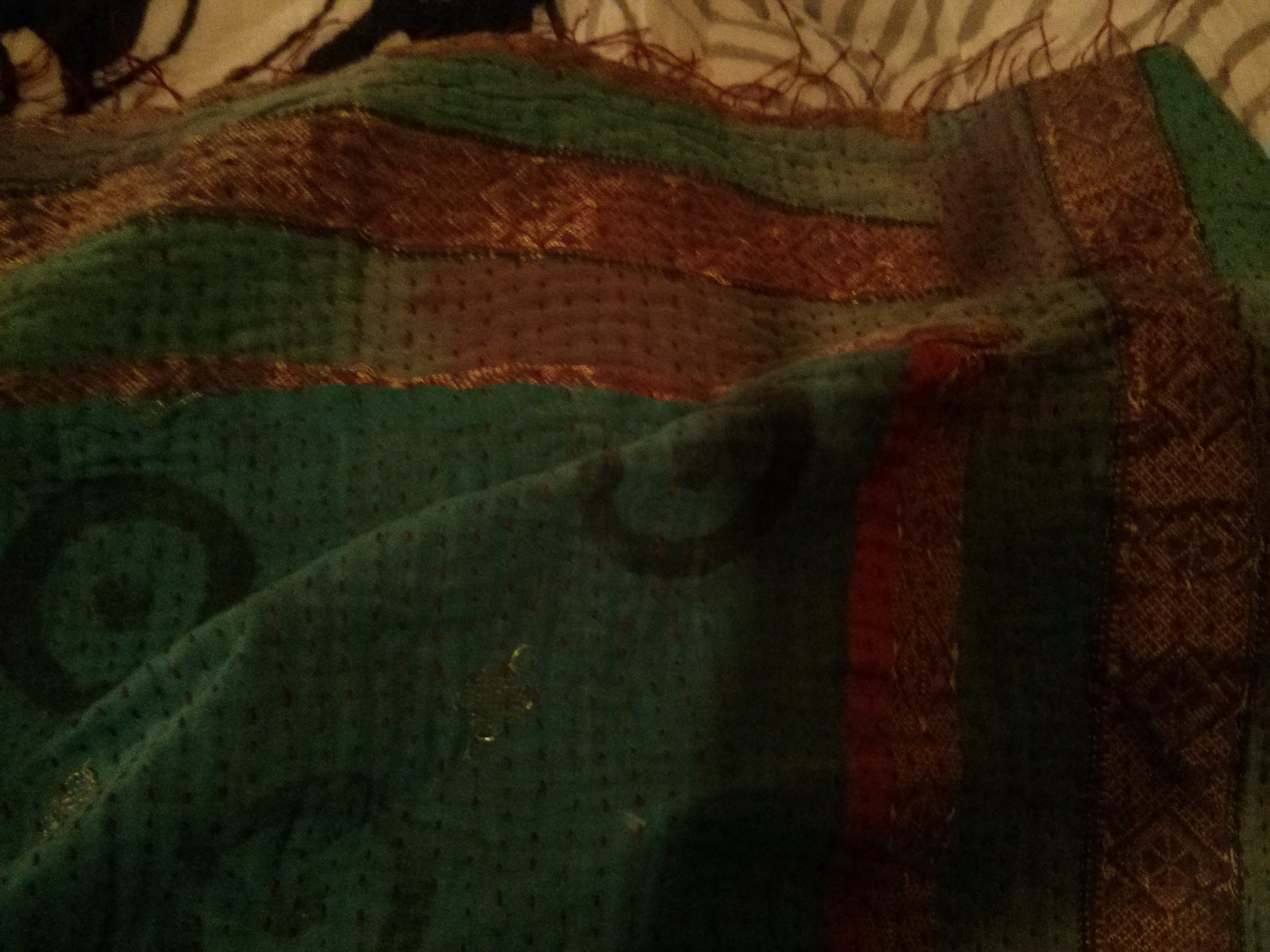
And here is the reverse:
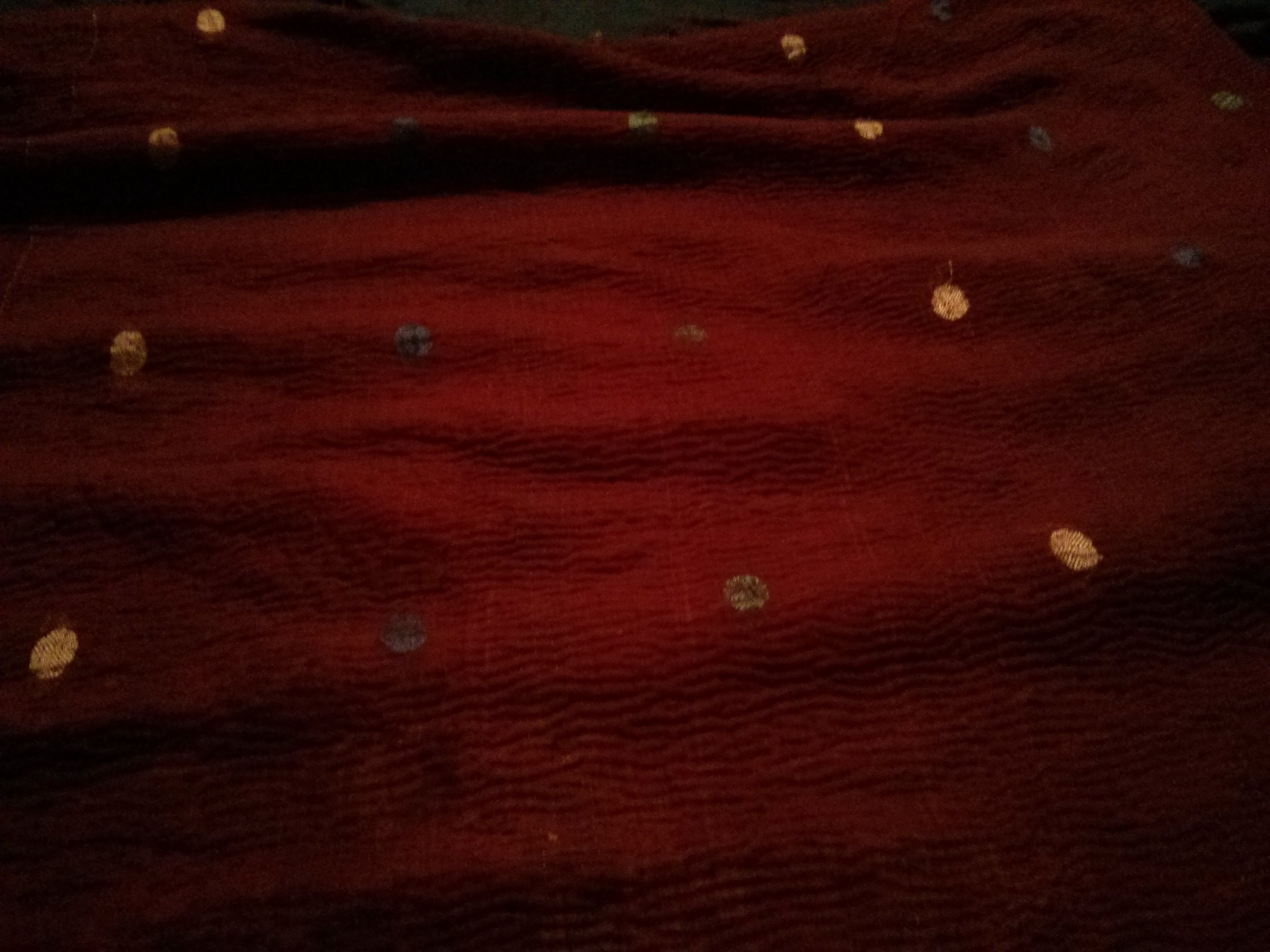
Here is my commercial quilt’s top:

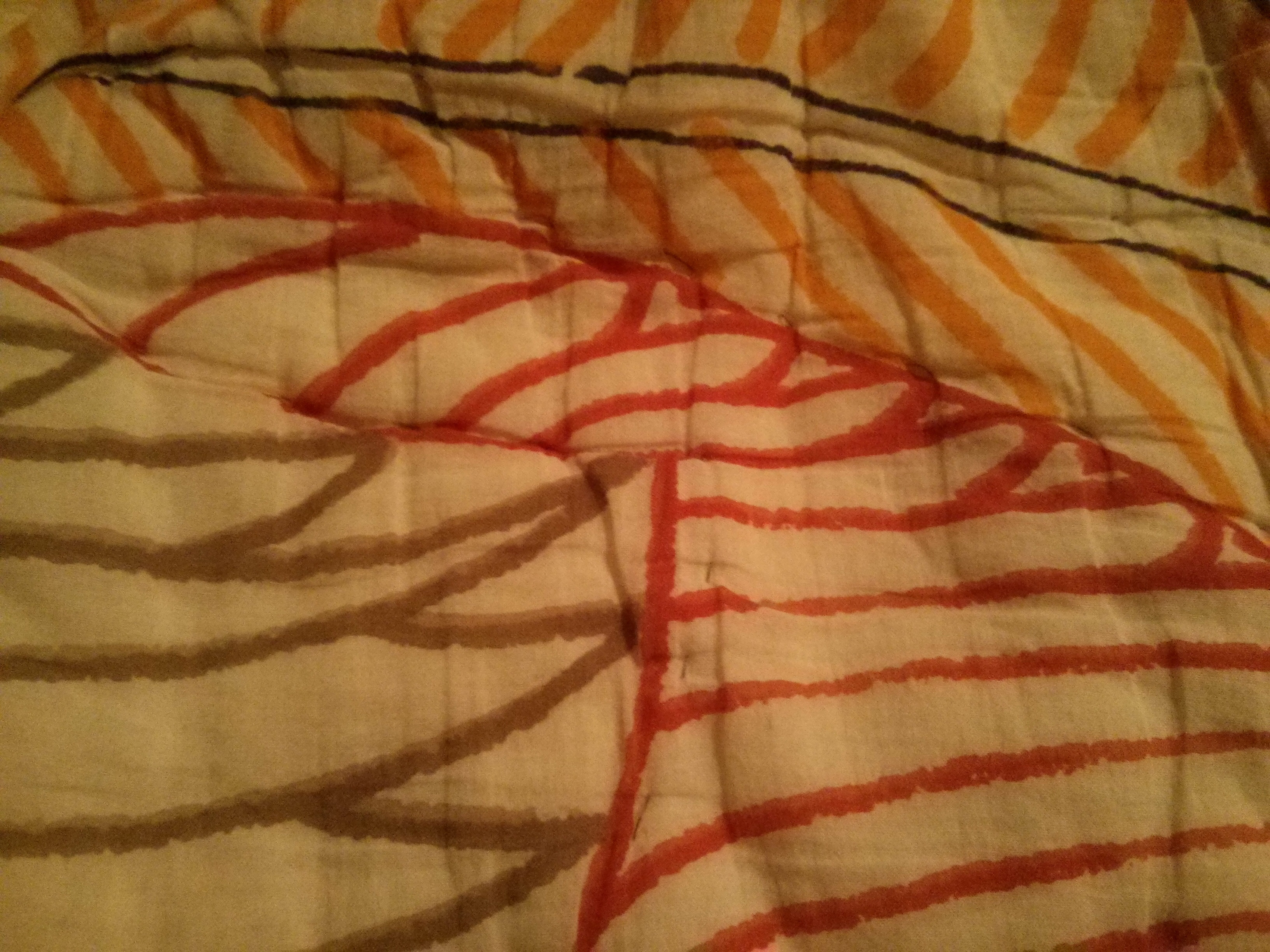
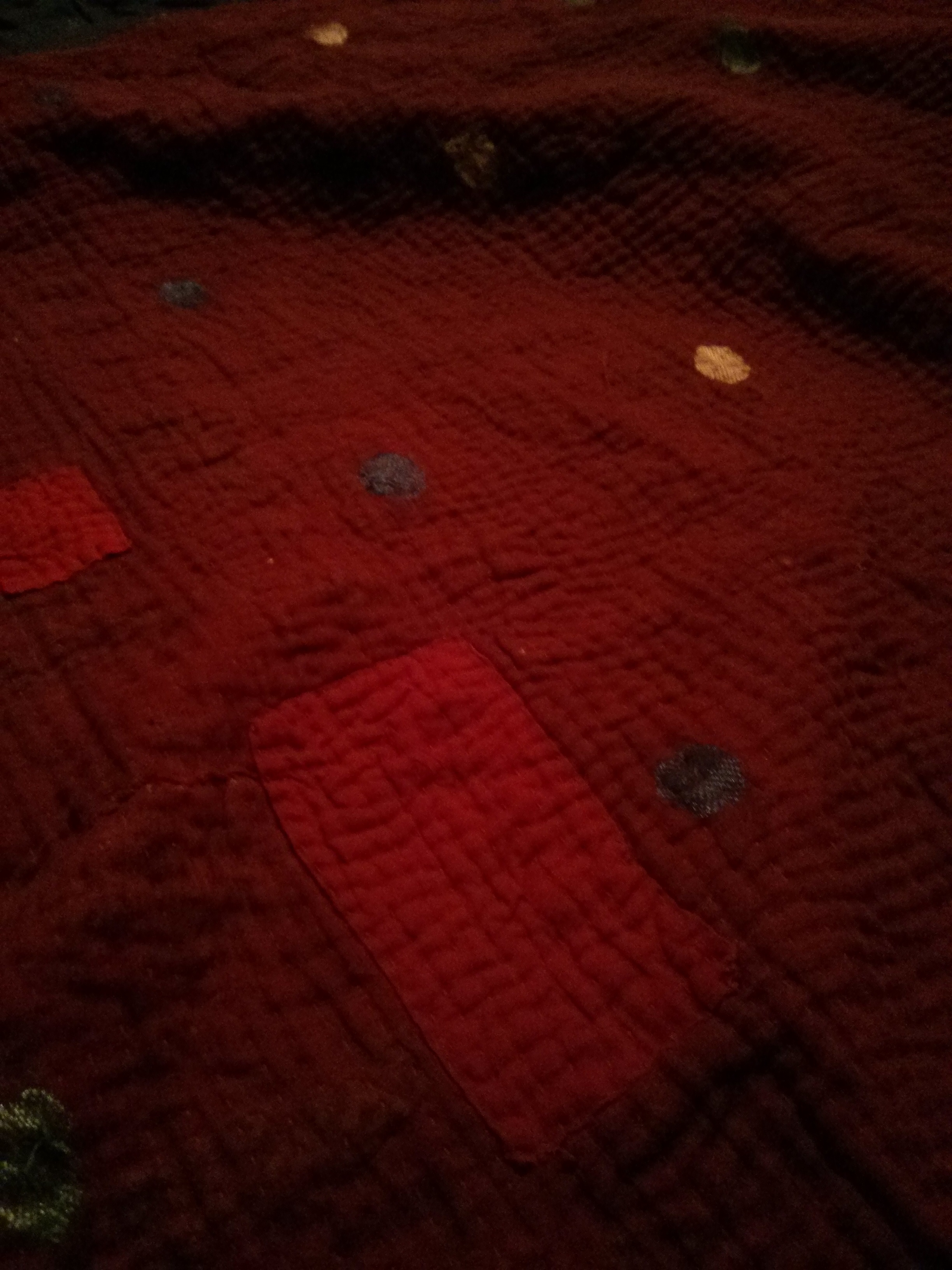
And here is the reverse:

Which is beautiful? Which feels better?
The kantha quilt is full of centers – localized zones of symmetry, special coherence, marked centers-within-centers, compactness, convexity – sets of points that cohere, and that draw the eye as identifiable, memorable, and describable patterns.
On the top side, the imperfect, faded printed circles with dots in the center are the most obvious centers. But the ribbon border is also a center, and each of its five stripes are centers. The regular-but-subtly-varying rows of stitches are centers, as is the loose fringe of threads at the end of the quilt. On the reverse, the rectangular, hand-stitched patches of contrasting fabric are centers, as are the threadbare zones of wear. The blue, green, and yellow machine-embroidered ovals on the sari fabric are centers. All the patterns work together to create larger patterns, with the circles defining zones of space between them, the stitching giving the quilt rich texture and a perceptible axis, and the wide, well-proportioned border strongly emphasizing the shape.
Compare the mass-market quilt. It hardly has any centers, and its few centers are not very strong. The texture of the fabric is perfectly uniform. The printed designs form few compact, convex sets, and the overall effect is kind of a confusing mess, with little form to be perceived. The black borders around the leaf shapes provide weak centers, as do the shell shapes. The grey border is a weak center, much weaker than the wide, well-proportioned border of the kantha quilt. There are a few haphazard hand stitches in grey on the quilt, stitched around the borders of the weak forms on the printed fabric, often forming the perimeter of a weird, irregular, concave, difficult-to-describe shape. The reverse has nice round printed designs in two sizes and colors, but the incoherence of the stitching is revealed even more here, since it lacks the printed pattern of the top side to give it context. There are ridiculous shapes that make no sense. Also, since the fabric is ordinary factory-made fabric, it has no variation or wear to give it appealing richness.
While the second quilt is not exactly ugly (I bought it and I like it), it does not have the “life” or “wholeness” of the kantha quilt. I would be surprised to find that someone found the mass-market quilt more beautiful, or better-feeling, than the handmade one.
Now let’s turn to wedding rings. The wedding ring itself forms a beautiful center on the hand, which itself is a center and has many centers: its fingers, fingernails, and knuckles, for instance. The ring divides the hand into zones, left and right (asymmetrically, it might be noted – perfect symmetry is not a requirement, merely a common occurrence). It also divides the hand into halves – the fingers and the palm (n.b. it divides the rectangle of the hand in a similar manner to the example of a single dot on a rectangular sheet of paper, worked on pp. 81-82 of The Nature of Order Volume One, suggesting similar “centers”).
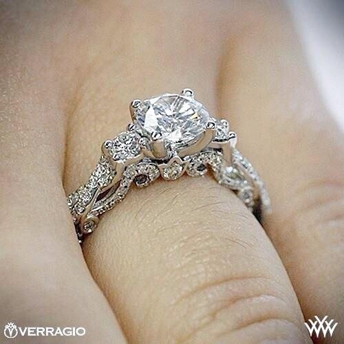
Here is my wedding ring:
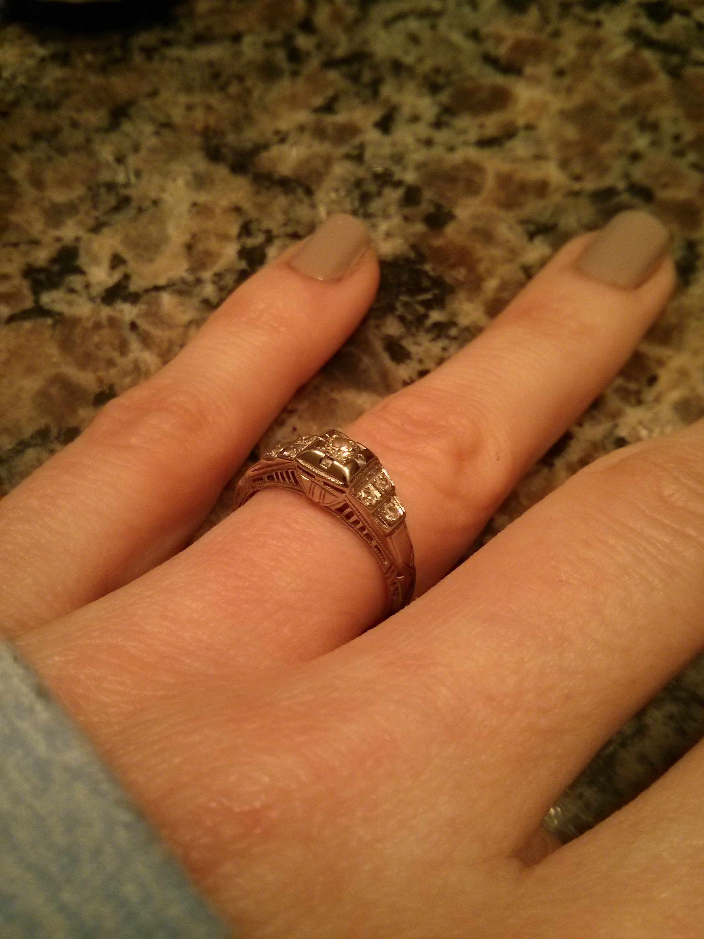
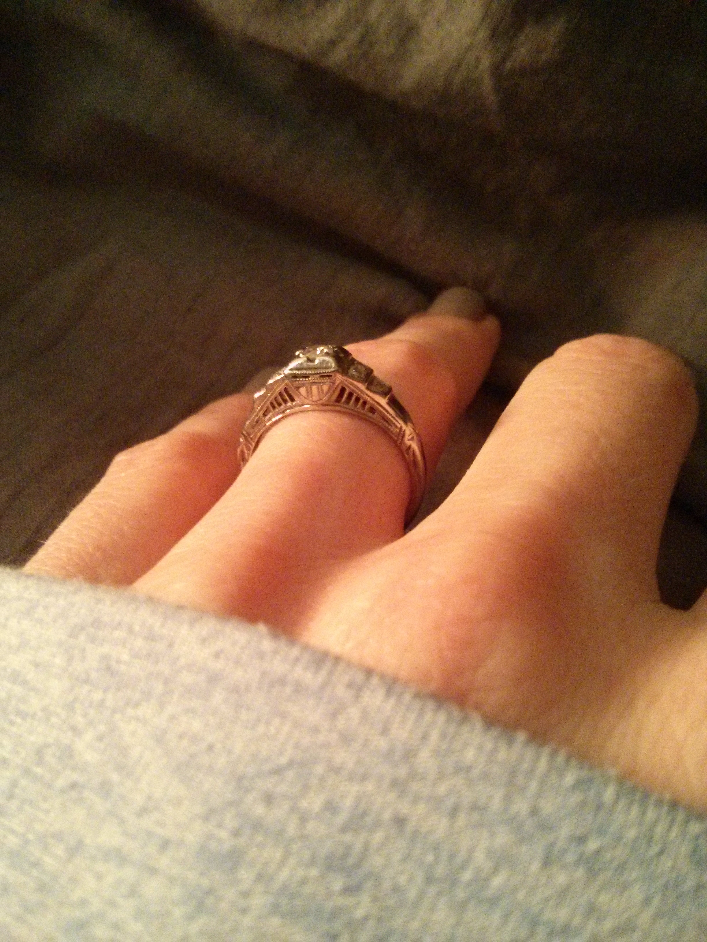
It forms a lovely center, but again, it is also full of centers. The central diamond at the peak is a center, supported by the two terraces on each side, with two and one tiny diamonds, in descending order. The terraces support the peak. Along the sides, delicate “columns” with spaces between them form (convex) centers, as do the spaces, supporting a central arch. The detailed area cupping the “box setting” that holds the central stone is a strong center from the side. The entire structure is coherent: terraces over a bridge.
Compare Kim Kardashian’s engagement ring:

There is only one center here: a giant, rectangular “rock.” It is bordered by two smaller rectangles – at least it is symmetrical; think how ugly it would be with only one of the side diamonds. The second ring worn closer to the body does not cohere with the engagement ring (see the double ring pattern, below). The engagement ring’s diamonds seem rather ham-handedly attached to the ring itself; its industrial construction makes me think of a lucite (clear plastic) handle molded around a stainless steel railing, or this kind of bathroom fixture:

The Kardashian ring is an extreme, hypertrophied form of a beautiful form, which is the most simple form of an engagement ring, a stone on a ring. While it only forms one center, it is a very lovely and powerful one in the context of a hand:

In American culture, it is common for married women not to wear their “engagement rings” alone as wedding rings, as I do, but to wear them together with a wedding ring, perhaps even welded together:
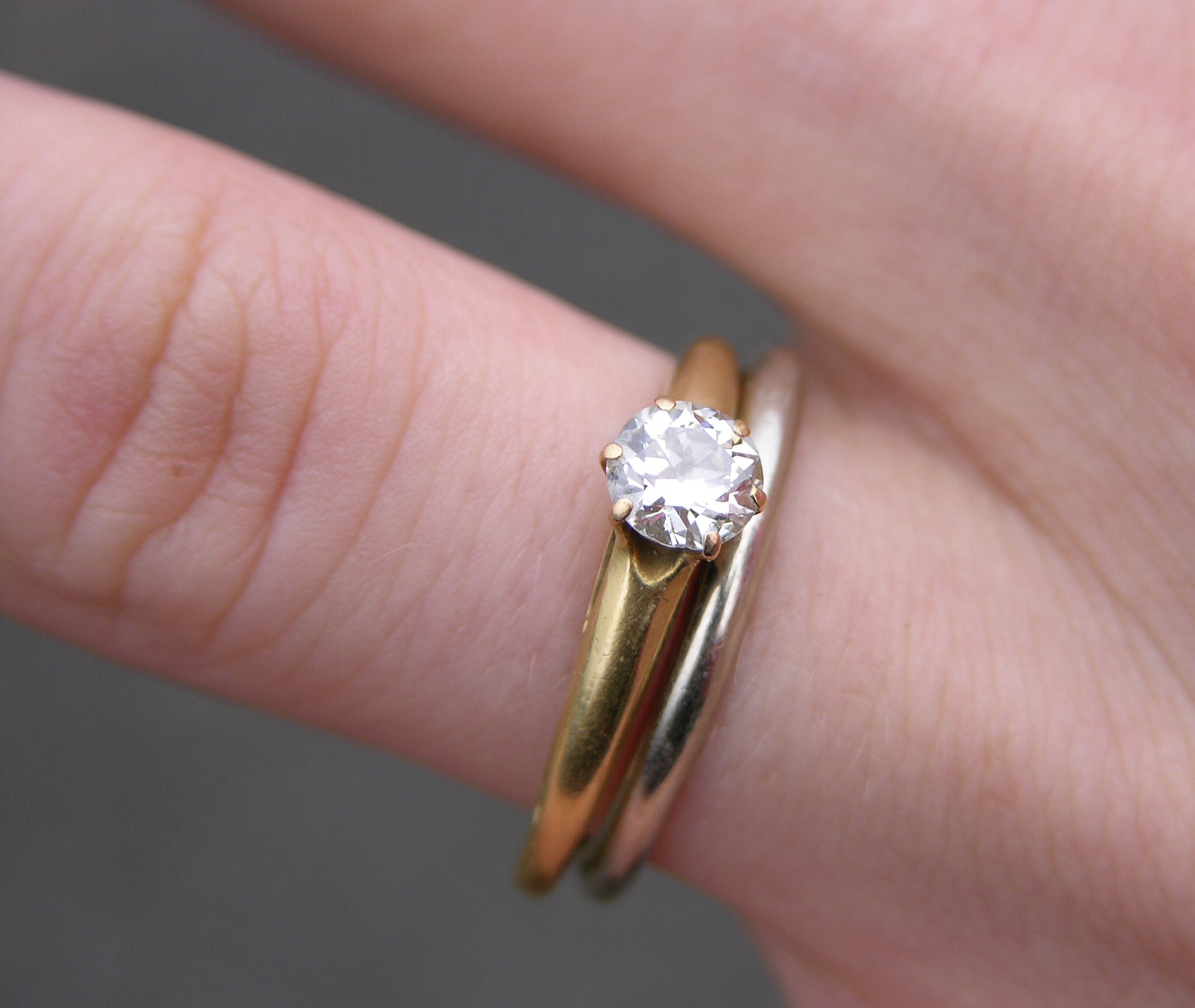
This takes away much of the power from the simple ring pattern, adding an asymmetry and crowding that doesn’t feel right to me. (And think of all the patterns on the side of my ring that a “wedding band” worn next to it would block and render lifeless.) Some designers, understanding this, produce wedding ring “sets” made of three rings, with one central “engagement ring” and one wedding ring on either side of it. This creates symmetry, but at the expense of forming one big, thick ring, destroying the delicacy of the slender ring pattern:

My ring is not more beautiful simply because it is more detailed. Here is a highly detailed ring without strong centers:
There is no overall coherent shape, and the zones of points formed by the diamonds and filigree are, to varying degrees, not coherent, compact, regular, or convex. It is hard to describe this ring, hard to remember it, hard to say just what its centers might be, if they exist.
I am interested to know whether my “center” analysis here corresponds to a universal or near-universal perception of beauty, or whether there are many whose genuine, felt sense – absent any ideas or opinions – is that the patterns I identify as less beautiful are, in fact, more beautiful. Comments are welcome but NO CRANKYPANTS.

Data point on the rings: looking only at the photos, my gf said she liked #3 most, then #4, then #1. I hope this is not a cranky comment but rather a loving one.
LikeLiked by 1 person
Totally not crankypants and appreciate the data 😉
LikeLike
nice ring, very art deco
LikeLiked by 1 person
I believe it is from that era – it’s definitely old!
LikeLike
You have a gorgeous ring. My eyes get drawn in by the lines on the side view.
I strongly want a more robust vocabulary for describing things that are aesthetically pleasing. So thanks for this article!
LikeLiked by 1 person
The existence of a center seems to provide more of a sense of order, it “makes sense” of the sensory input. One might then ask why do we like a little bit of disorder–my answer to that is that people (and any other complex system) want novelty, but novelty that it’s possible to make sense of, rather than directionless chaos.
I am largely in agreement with your feelings, but I can’t help but think back to a time in elementary school when we were all polled about whether we liked Doric, Ionic, or Corinthian style columns the best. I found the Corinthian columns to look idiotic in their melodramatic levels of baroqueness, but the vast majority of my classmates favored them. Very anecdotal, but it makes me have to think twice.
OTOH, I don’t think asking people questions is a good way to know what they like, as weird as that sounds. It seems much more reliable to observe how people behave around something.
LikeLiked by 2 people
Strongly agree. I have a friend who is a serious food critic and he tends to say it’s better to pay attention to what people are eating rather than what they say they like best. What dish disappears the fastest? However, this breaks down when only ugliness is on offer.
LikeLiked by 1 person
I have to admit that I find the last ring beautiful, though I generally agree with your analysis. It reminds me of a king’s carriage, ala Versailles or something? http://www.clubtimes.com/oparka/images/paris/Versailles%20Carriage.jpg But I believe that being surrounded by this all the time would be mentally taxing. Is there such a thing as novel beauty, or a beauty that comes from complexity? Mandelbrot sets are sometimes quite beautiful, they are complex (but they of course have a pattern.)
LikeLiked by 1 person
btw, never stop writing.
LikeLiked by 2 people
I would probably prefer to curl up in the handmade quilt when I was feeling depressed and needed comforting, but I would also call it unambiguously ugly. It feels more comforting, but the machine-made quilt, especially the reverse, is significantly more beautiful.
LikeLiked by 1 person
The last one has a tentacular, almost chthulian quality. Would look good in R’lyeh, maybe.
LikeLiked by 1 person
Nice try, this was post was obviously just a ploy to show off your wedding ring 😉
It strikes me that centers don’t have to exist only exist in physical space, but also in concept space. In particular, it seems related to our tendency to act as if Aristotelian realism is true, or at least as if all concepts have clear, sharp, non-arbitrary boundaries. (Paging David Chapman)
This probably has important real world implications too. If you’re a business and you have this sweet multi-tool product, marketing it as such might not be a good idea. If the product exists in two centers, you’re better off picking one and treating the other as if it’s just some extra feature. It’s not a camera and a phone, it’s a phone that happens to have a camera. Apple is very good at this – the iphone, ipad, and macbook occupy different categorical centers in mindspace: phone, tablet, laptop. Microsoft has done a lot to blur the tablet / laptop distinction with Windows 8 and its Surface line. On the one hand, this seems useful – why have 3 devices when I can have 2 to do the same set of jobs? On the other hand, their tablet/laptop hybrids don’t really feel like a tablet or a laptop, which often makes for a frustrated user. (I own an Asus netbook/tablet hybrid w/ Windows 8, and the interface is often frustrating because it tries to be everything to everyone. Also for other reasons.)
LikeLiked by 1 person